TOA Waters Website Redesign
TOA Waters
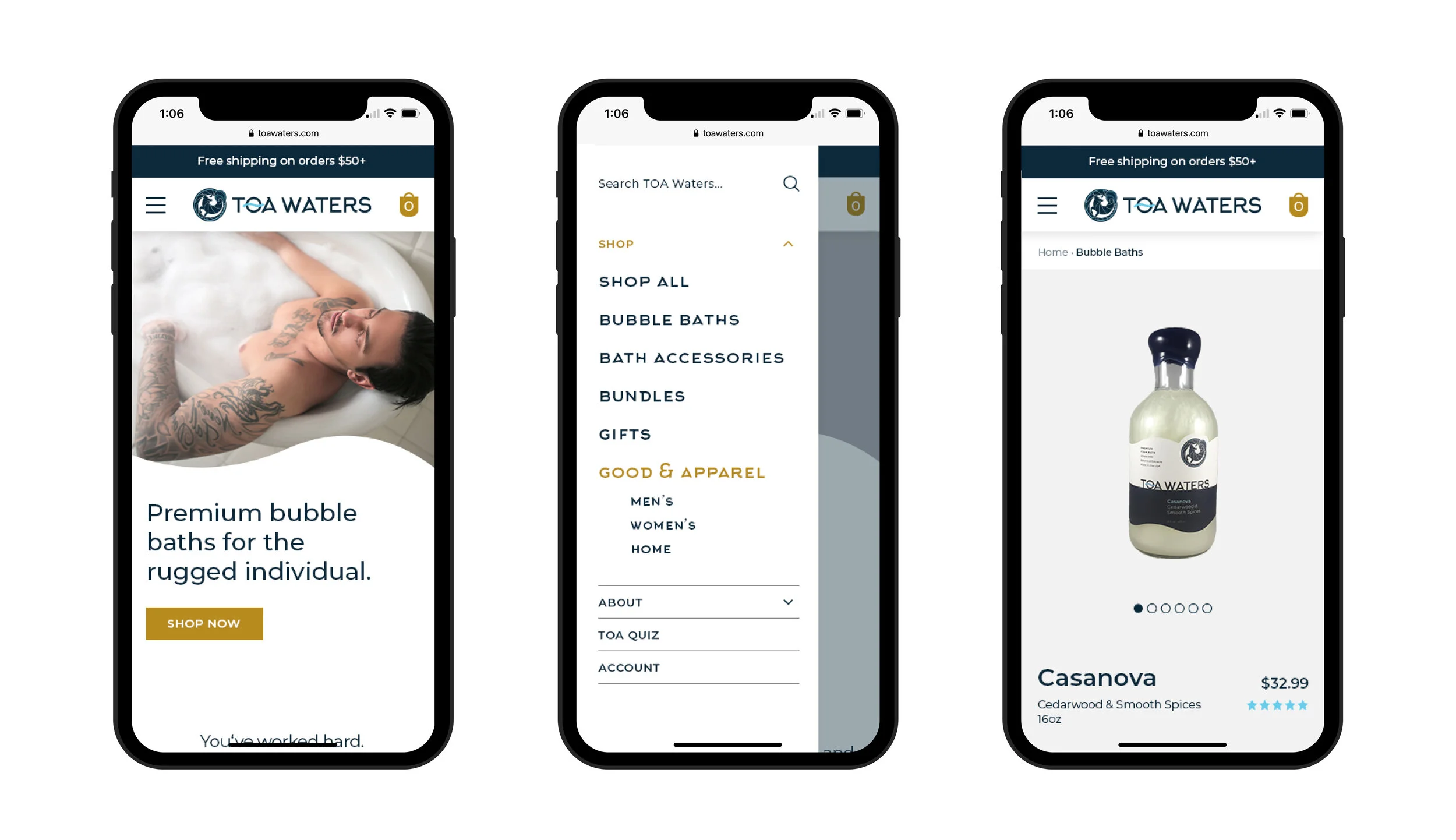
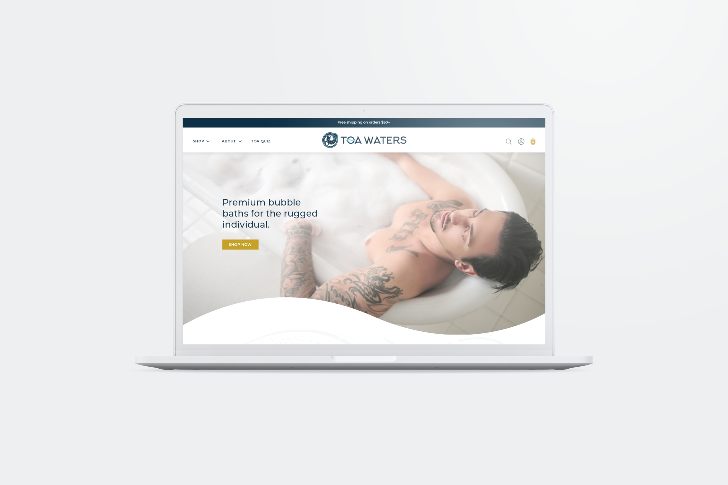
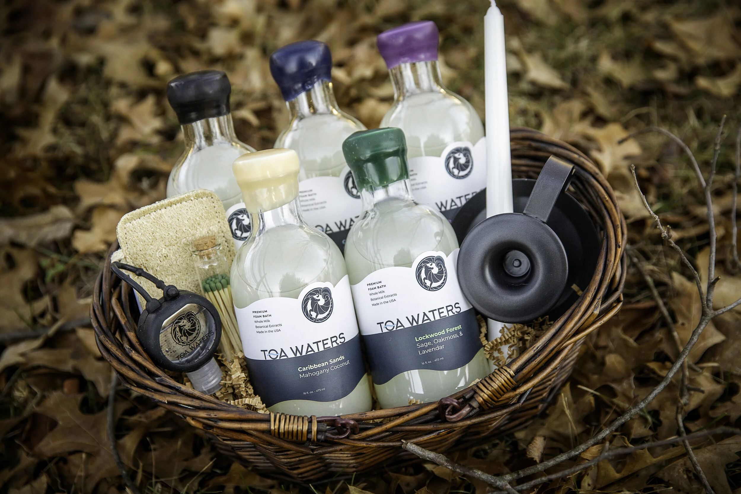
TOA Waters is a new, luxury bath soap for the rugged. Working with the established brand elements, I designed the labels and later went on to re-design the e-commerce website, creating a cohesive visual language and tying the online presence to the physical product.
ROLE
Label Design
Wireframing
Prototyping
Visual Design
UI
STUDIO
Freelance
PROBLEM
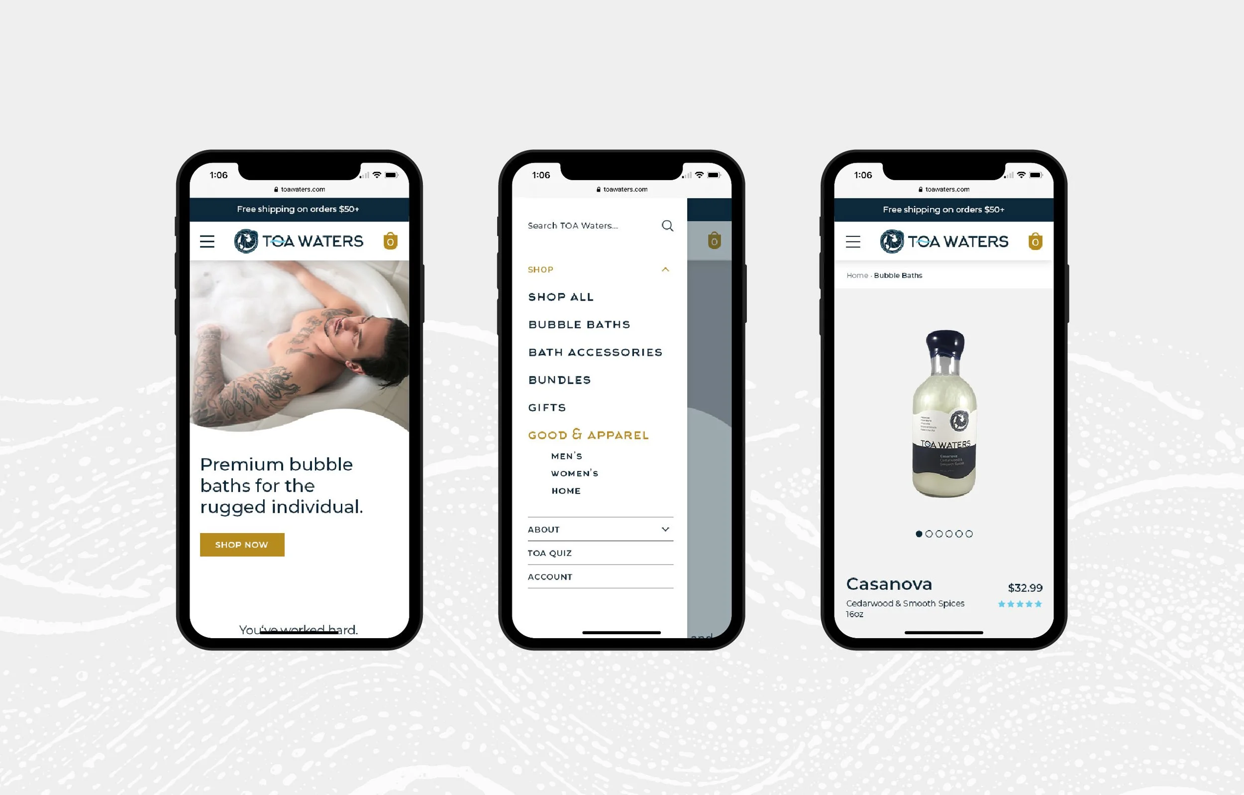
Kicking off the website re-design project, I wanted to better understand the client’s goals and main areas of focus. The main concern of the client was that the website did not align with the look of the product itself. Second, not only was it basically unusable on mobile, the site was on the verge of crashing any day. So we needed to act quick.
SOLUTION
Despite having no user data (and very little UX experience) I decided to approach the project with a Visual Design lens. I created a 5-week timeline to complete 10 pages. This included rounds of lo- and hi-fidelity mockups. I managed to trim the time down to 4 weeks because I made the decision to start with mid-fidelity mockups, to be able to discuss structure, functionality, and visual design all at the same time.
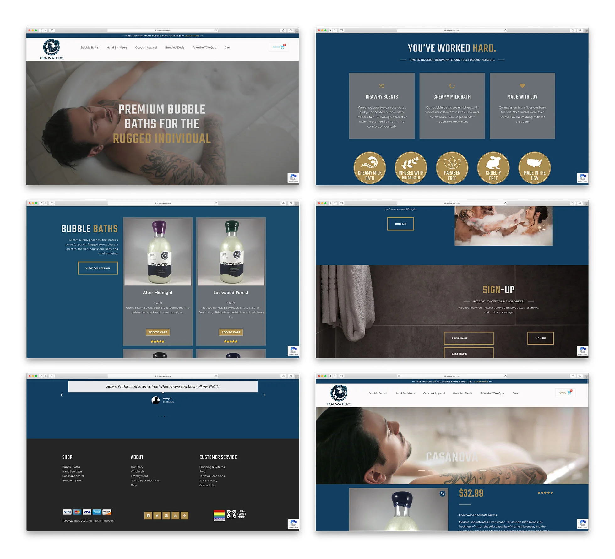
Previous State
The previous state of the website had several issues:
Overall site navigation needed restructuring — hierarchy was disorganized and it was unclear how to access certain pages
Missed opportunities for CTA’s
Some links and text were difficult to read
Wayfinding was difficult
There was a lack of consistency with visual design and overall look did not align with the label design
After analyzing the current state and gaining insights into competitors, I began the real work. I tackled the information architecture first — going from a wide structure to a vertical structure, I reduced redundancies and created a hierarchy that allowed for business growth.
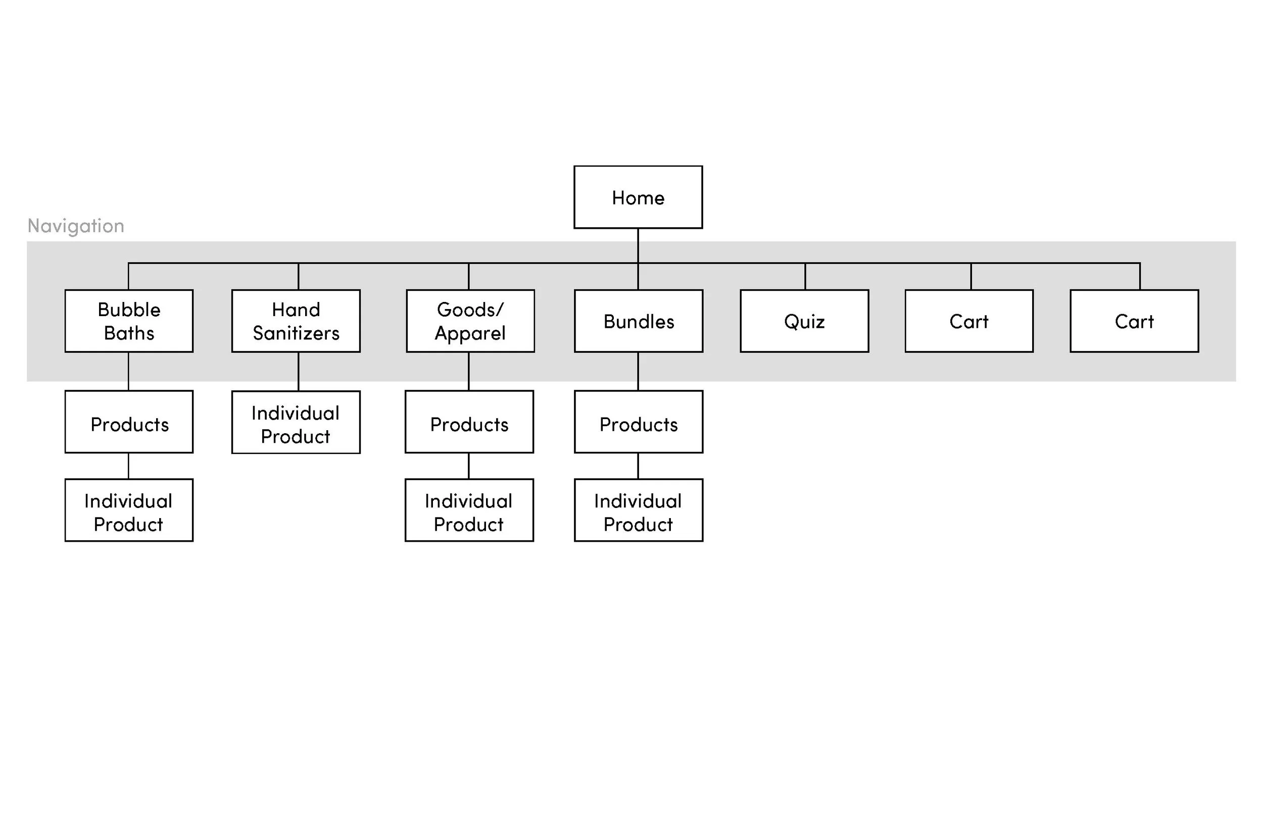
Before
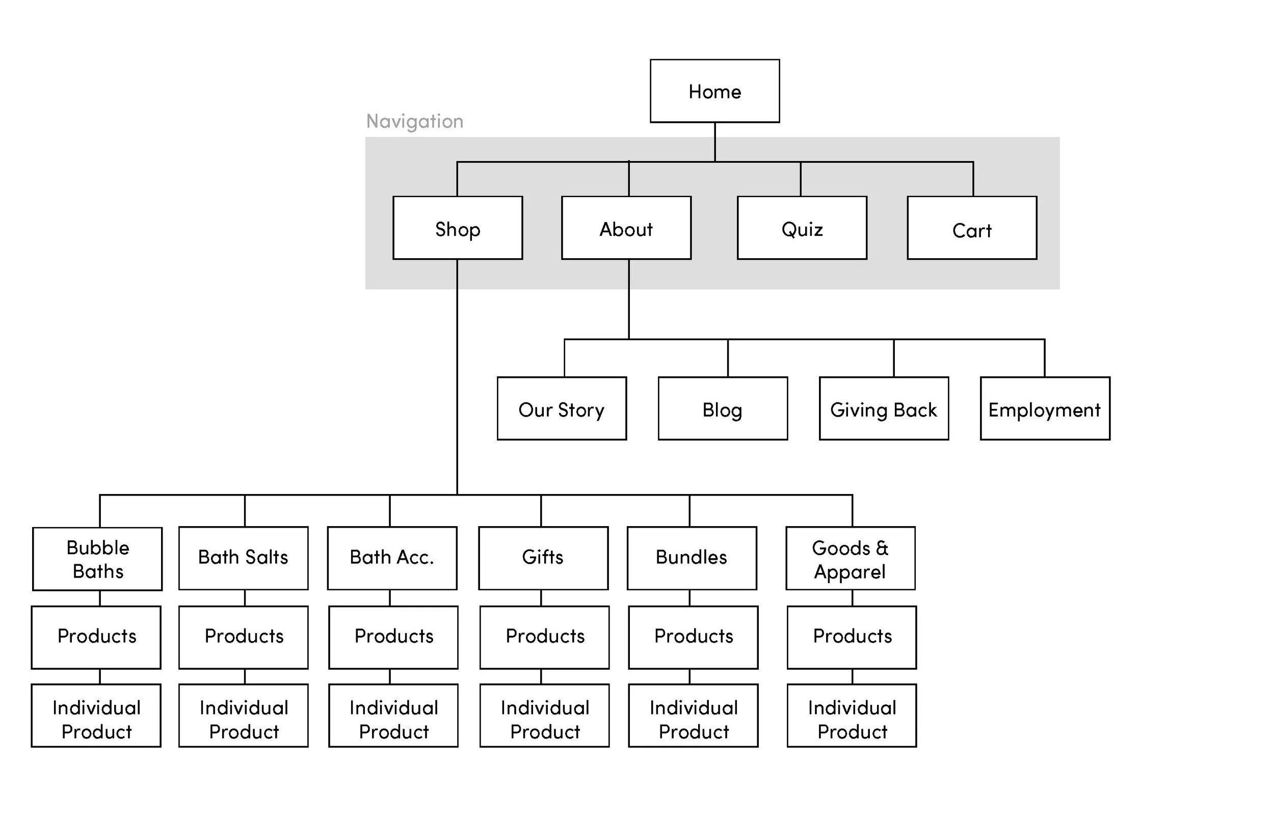
After
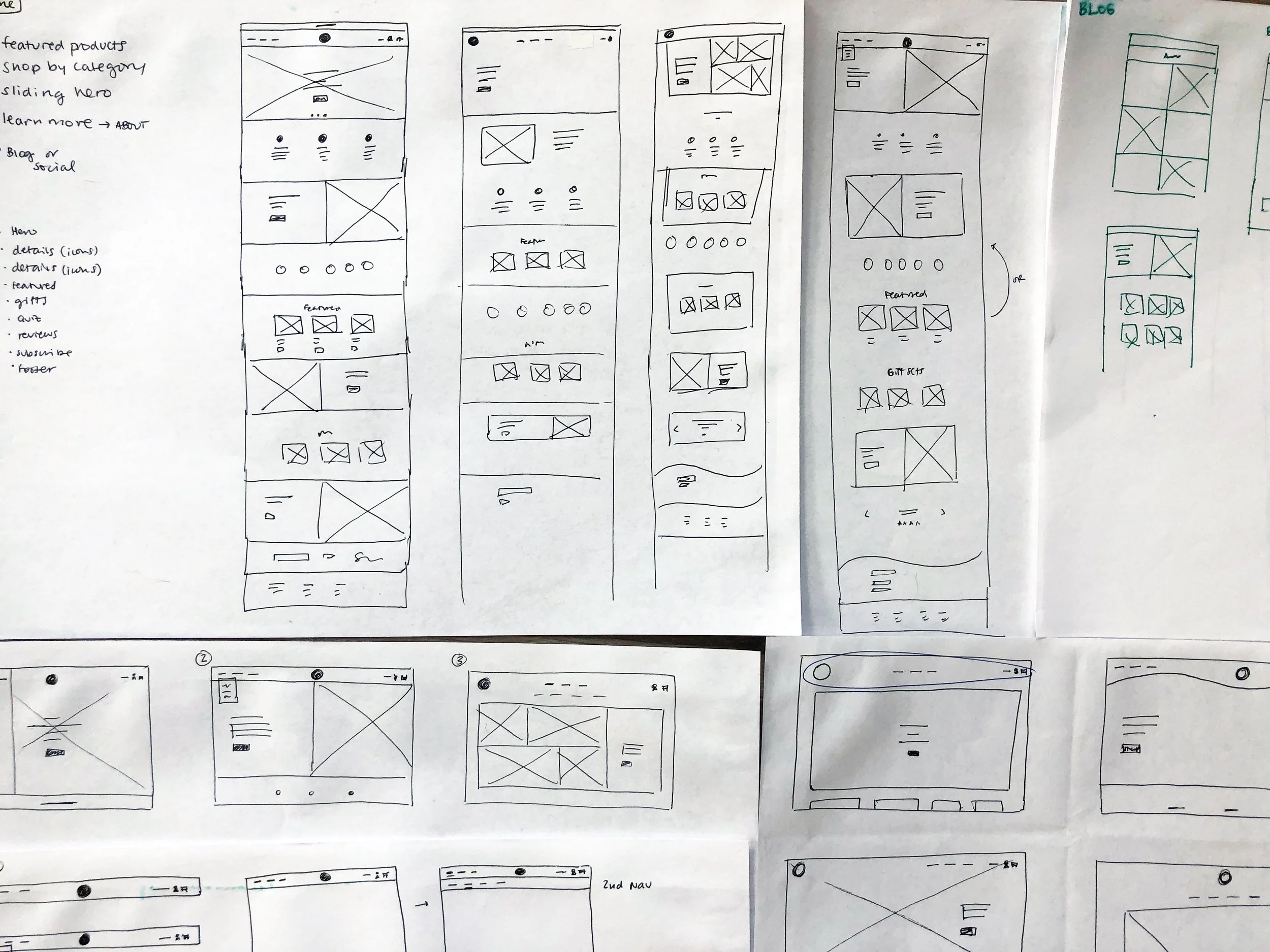
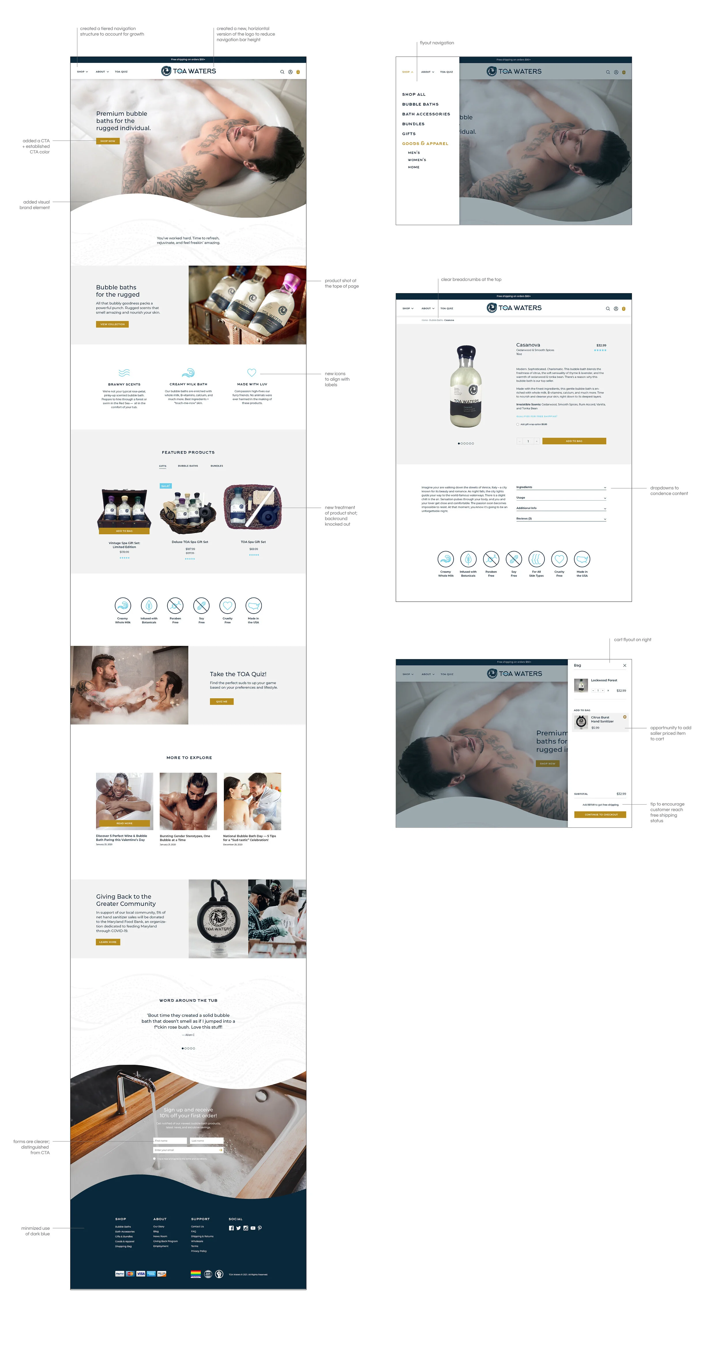
From there, I produced as many hand-drawn sketches as I could. As a team of one, I had to be decisive. I narrowed the options to two concepts that differed in visual style and structure. Once my client and I agreed on a direction, I began to build out the remaining pages. Below I’ve noted some of the final changes.
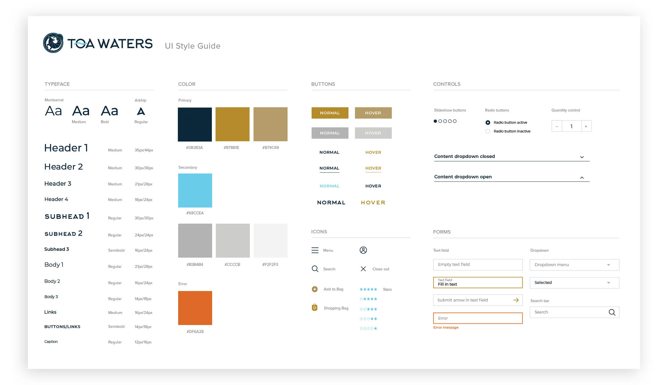
My first experience creating a UI style guide:
